Information
Section: Main types of graphs used in this course
Goal: Understand the basic types of graphs that are used in this lecture.
Time needed: 10 min
Prerequisites: Curiosity
Main types of graphs used in this course
In this course, we will work a lot with visualizing data. On this page, we present and explain a few types of graphs that will be often mentioned and used in the first chapter.
Distribution of an attribute
There are a few ways to represent the distribution of an attribute in the dataset. In the course, we will mainly use histograms and boxplots.
Histogram
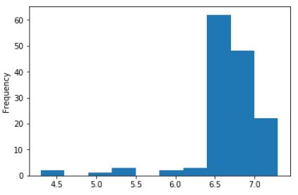
A histogram represents the number of instances (frequency) on the y-axis, and the value itself on the x-axis. We can interpret this graph as: there are approximately 60 instances in the dataset with a value comprised between 6.4 and 6.7 (the highest bar on the graph).
Another example: there are approximately 2 instances with a value comprised between 4.3 and 4.6.
Boxplot
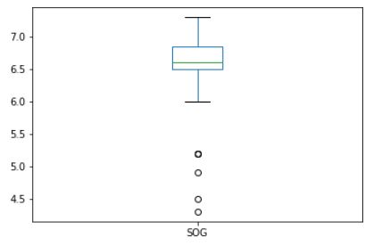
The boxplot represents the distribution of the attribute through the quartiles.
The quartiles are thresholds in the dataset representing the proportions of instances that have a value before or after a certain value. The quartiles then cut the dataset into 4 parts: 25% of the instances have a value under the first quartile, 25% of the instances have a value between the first and the second quartile, 25% between the second and the third, and 25% after the third quartile. This means also that 50% of the instances of the dataset have a value lower than the second quartile (also called the median) and 50% higher than it.
On a boxplot, the quartiles are represented in the main box in the middle. The green line represent the median (or second quartile). The two line extending from the box represent the values lower and higher than the first and third quartile. Finally, the 4 dots we see at the bottom are outliers: a few values that are far away from the other values.
This graph can be read as:
“50% of the instances in the dataset have a value for SOG lower than 6.6.”
“25% of the instances have a value for SOG higher than 6.8.”
“Most of the instances have a value for SOG higher than 6.0, except for 4 exceptions (outliers).”
Two lists against each other
Two attributes
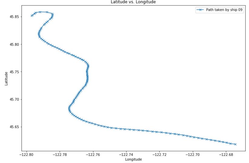
We often want to represent two attributes against each other in a dataset, to try to find a relationship between them, or simply to represent data. Here, we plotted the latitude against longitude values, to represent the path taken by a ship over time.
On the x-axis the values for longitude are represented, and on the y-axis, the values for latitude.
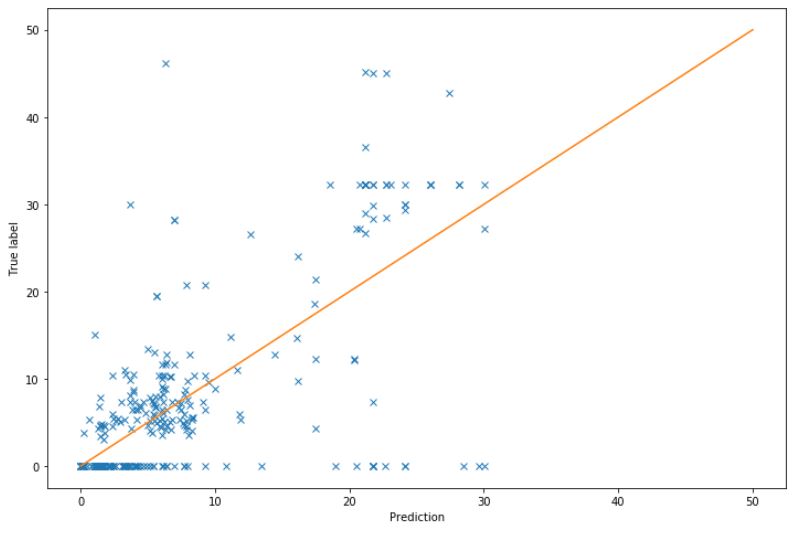
Prediction vs. True label
To analyze the result of a prediction, we sometimes want to plot the predictions made on the testing set against the true labels of the testing set. If the predictions were all perfect, all the points on the graph would be located on the orange diagonal, representing perfect predictions (it is the line were prediction = true label).
In this case, the prediction is not really right, for example, a lot of values were of 0 in the testing set, but the model predicted higher values for them. Usually, a good model will give predictions close to the diagonal.