Information
Section: Color distribution
Goal: Understand how to gauge the color distribution of an image and how to interpret histograms.
Time needed: 10 min
Prerequisites: Basics about image processing
Color distribution
Theory
A method to gauge the quality of an image, depending on what we intend to do with it, can be to look at the distribution of the colors.
This is useful to see if a pure color is present in the image, and for example is the point of the picture: a spike at the very end of the histogram for this color reveals that the color is present in its pure form on the image (a lot of pixels having a high value for this color).
It can also help to understand if the dataset is fit to a specific task. For example, in a task of traffic signs recognition, the distribution of the colors can be an important feature to look for, as it is likely to represent the class of the traffic sign (red for a prohibition, white for a danger or an obligation, etc…). Coupled with a shape analysis, one can build a model to recognize traffic signs.
In the same way as for the grayscale histogram, we can plot the histograms of the values of the different colors.
Each histogram is plotted using, for each pixel, only the value of the color we consider (0 for red, 1 for green and 2 for blue). Here, we plot the three colors on the same graph, so instead of a bar histogram we prefer to plot lines for readability. This is the purpose of the parameter histtype = 'step' in the function.
import matplotlib.pyplot as plt
from skimage import io

image = io.imread('./data/1.jpg')

plt.imshow(image)

plt.figure()
plt.hist(image[:, :, 0].flatten(), bins = 256, color = 'r', histtype = 'step')
plt.hist(image[:, :, 1].flatten(), bins = 256, color = 'g', histtype = 'step')
plt.hist(image[:, :, 2].flatten(), bins = 256, color = 'b', histtype = 'step')
plt.xlabel('color value')
plt.ylabel('number of pixels')
plt.show()
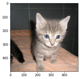
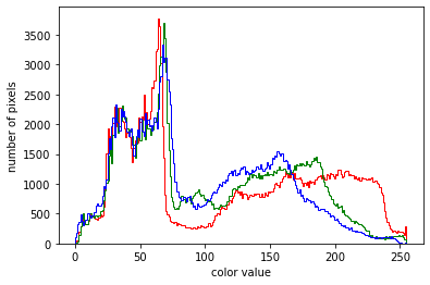
For this image, we can see that the 3 colors are more or less blended together, meaning that the picture contains mainly grey and probably not one dominant color. The red curve goes a bit higher in the value range than the other colors: we see on the image a pink carpet.
To better understand what the histograms represent, have a look at other pictures. Change the name of the picture 1.jpg by any integer in the range [1, 20].
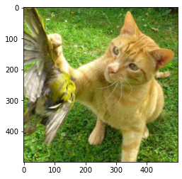
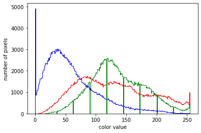
image = io.imread('./data/5.jpg')
plt.imshow(image)

plt.figure()
plt.hist(image[:, :, 0].flatten(), bins = 256, color = 'r', histtype = 'step')
plt.hist(image[:, :, 1].flatten(), bins = 256, color = 'g', histtype = 'step')
plt.hist(image[:, :, 2].flatten(), bins = 256, color = 'b', histtype = 'step')
plt.xlabel('color value')
plt.ylabel('number of pixels')
plt.show()
# For beginner version: cell to hide

import matplotlib.pyplot as plt
import ipywidgets as widgets
from ipywidgets import interact
from skimage import io

def plot_hists(image_nb):
    image = io.imread('./data/' + str(image_nb) + '.jpg')
    plt.imshow(image)

    plt.figure()
    plt.hist(image[:, :, 0].flatten(), bins = 256, color = 'r', histtype = 'step')
    plt.hist(image[:, :, 1].flatten(), bins = 256, color = 'g', histtype = 'step')
    plt.hist(image[:, :, 2].flatten(), bins = 256, color = 'b', histtype = 'step')
    plt.xlabel('color value')
    plt.ylabel('number of pixels')
    plt.show()


interact(plot_hists,
         image_nb = widgets.IntText(value = 1,
                                    description = 'Image:',
                                    disabled = False))
<function __main__.plot_hists(image_nb)>
Quiz
from IPython.display import IFrame
IFrame("https://blog.hoou.de/wp-admin/admin-ajax.php?action=h5p_embed&id=44", "959", "340")