Information
Section: Plot graphics
Goal: Get some tools to create plots with Python and Pandas.
Time needed: 15 min
Prerequisites: Curiosity
Plot graphics
As we work with data in this course, it is important to be able to represent graphically the data and results we will be working with.
This notebook provides you with some basic methods to represent the basic information about a dataset.
To know more about the different types of graphs, visit the page TODO: add link to graphs page.
Plot the distribution of the attributes of a dataset (with Pandas)
The library Pandas comes with a method to easily represent some basic features about a Dataframe. The method plot() used on a Series or a Dataframe allows you to create several types of plots on the attributes.
As an example, let’s import an easy dataset and use the method plot() on the attributes.
# import the data

import pandas as pd

df = pd.read_csv('./trip9.csv')
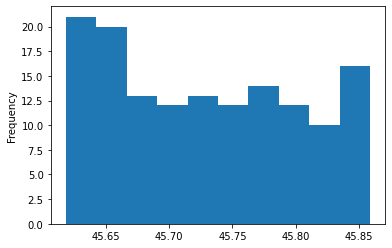
The method hist() plots the histogram of the Series. The histogram represents the distribution of the values of the attribute in the dataset.
# plot the histogram of the attribute 'LAT'

df['LAT'].plot.hist()
<AxesSubplot:ylabel='Frequency'>
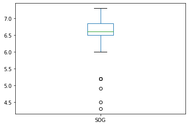
The method box() creates the boxplot of the attribute. The boxplot is another representation of the distribution of the dataset.
df['SOG'].plot.box()
<AxesSubplot:>
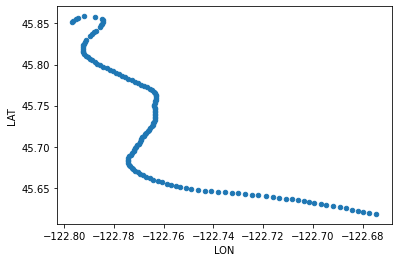
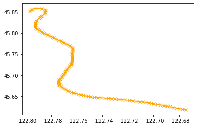
The method scatter() plots the values of 2 attributes against each other. For example, here we represent the attributes LON and LAT together to visualize the path of the ship.
df.plot.scatter('LON', 'LAT')
<AxesSubplot:xlabel='LON', ylabel='LAT'>
Other types of plots are possible with this method, visit the documentation for more information: https://pandas.pydata.org/pandas-docs/stable/reference/api/pandas.DataFrame.plot.html.
Plot some lists of values (with Matplotlib)
Matplotlib is a library that provides a lot of visualization tools for Python. In this course, we want to keep it simple and will only use a few methods of the pyplot API.
First, the library has to be imported:
import matplotlib.pyplot as plt
Then, we need to create the figure with the method figure(). We can specify the size of the figure we want to create:
plt.figure(figsize = (12, 8))
<Figure size 864x576 with 0 Axes>
<Figure size 864x576 with 0 Axes>
We can now plot any value we want, for example, we plot again the attributes LAT and LON of the previously used dataset. We use the method plot(), which comes with a lot of parameters. Here, we specify an 'x' for the type of marker we want to plot, and 'orange' for the color. We can specify a parameter label that can be used later for the legend.
plt.plot(df['LON'], df['LAT'], marker = 'x', color = 'orange', label = 'Path taken by ship 09')
[<matplotlib.lines.Line2D at 0x7fd36968bc88>]
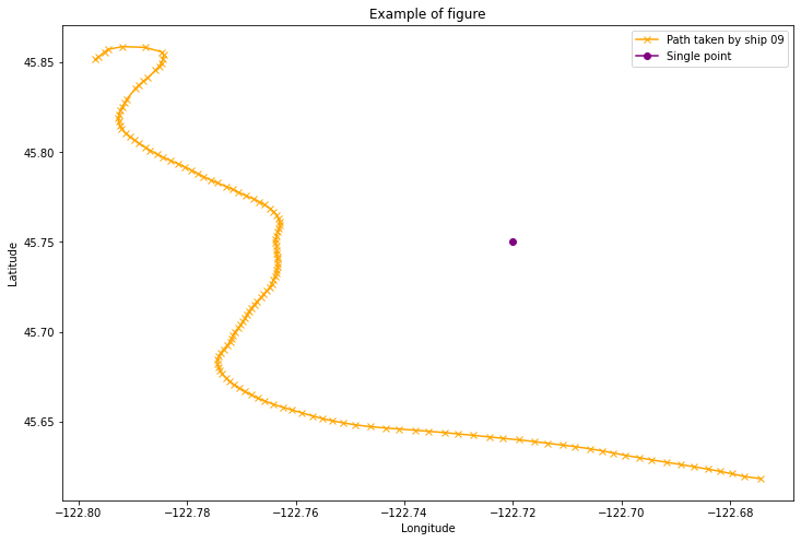
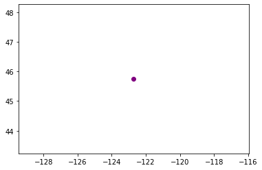
It is possible to add other plots to the graph. For example, we want to add a point with the coordinates [-122.72, 45.75].
plt.plot(-122.72, 45.75, marker = 'o', color = 'purple', label = 'Single point')
[<matplotlib.lines.Line2D at 0x7fd36967b470>]
We can combine the last 3 cells to create our final plot. We print the legend with the method legend(), specify a title with the method title and add the names of the two axes with the methods xlabel() and ylabel().
plt.figure(figsize = (12, 8))
plt.plot(df['LON'], df['LAT'], marker = 'x', color = 'orange', label = 'Path taken by ship 09')
plt.plot(-122.72, 45.75, marker = 'o', color = 'purple', label = 'Single point')
plt.legend()
plt.title('Example of figure')
plt.xlabel('Longitude')
plt.ylabel('Latitude')
Text(0, 0.5, 'Latitude')